Design: Product, Packaging & Visual Identity
No. 01 / Product Design
STATIONERY


Brief: Flower Heads is a collection of heirloom stationery and leather goods inspired by the poetic beauty of flowers. For the debut collection, I designed a suite of greeting cards, notepads, and memo pads using original hand-drawn block print florals. The goal was to create pieces that feel both timeless and personal—each one designed to be held, used, and cherished.
Process: Each floral motif was hand-drawn and digitally refined in Illustrator, inspired by vintage botanical prints and traditional block printing. The patterns and layout designs were carefully composed with soft borders, lined writing areas, and delicate typography. I prepared all production files and worked directly with the printer to oversee paper selection, foil stamping, and final output—ensuring the textures, finishes, and overall quality felt true to the heirloom spirit of the brand.
photo credit: Amal Iqbal
No. 02 / MAIL ORDER PACKAGING
PRETTY PETALS
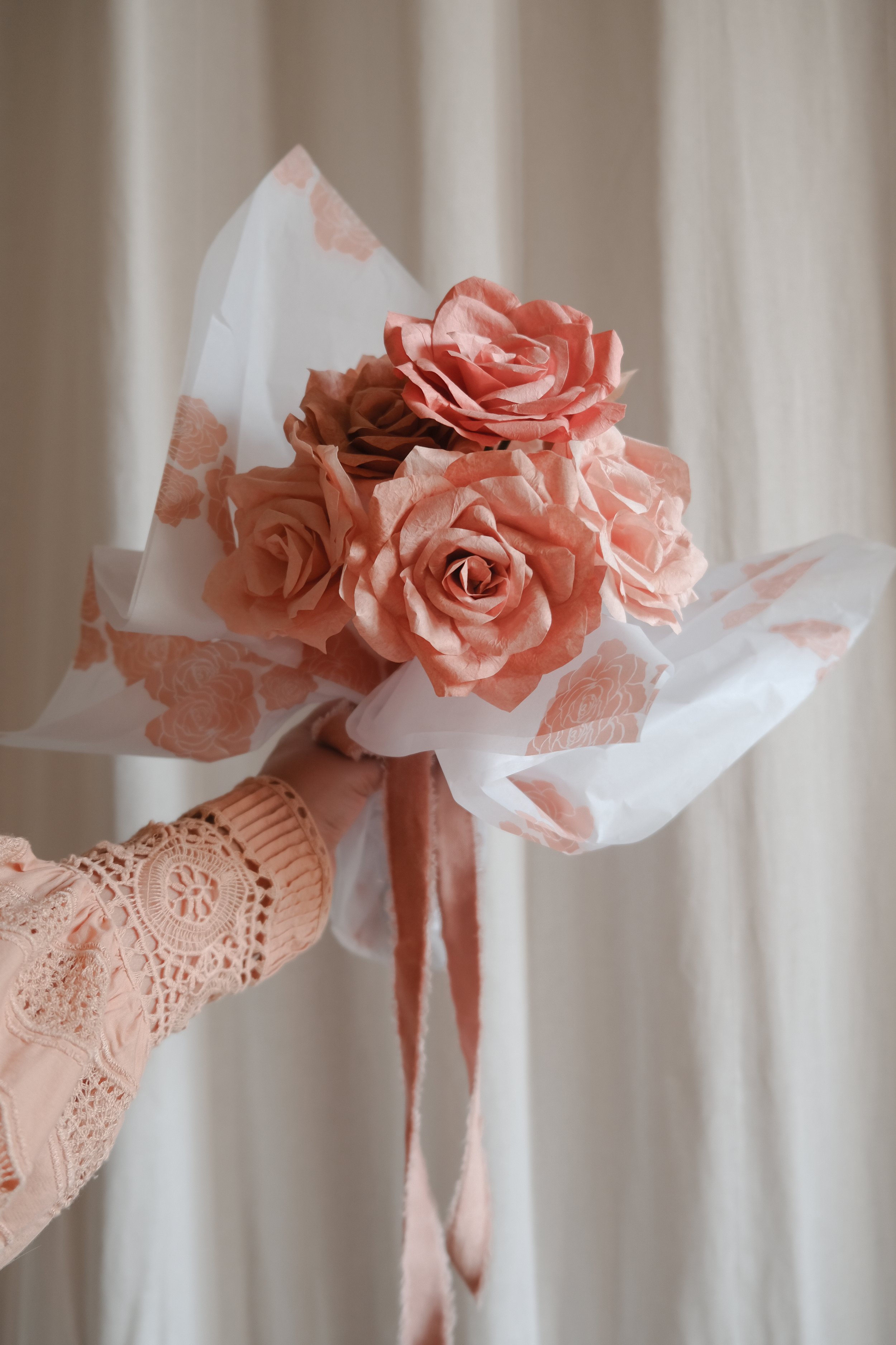


Brief: Following the creation of the brand identity for Pretty Petals by Lucy, I was asked to design the mail order packaging for her paper flower business. The goal was to extend the visual language of the brand into a tactile, memorable unboxing experience for her online customers—capturing the warmth and handmade quality of her offering through thoughtful details.
Process: I applied the established rose illustration across custom tissue paper, oval and rectangular sticker labels, washi tape, and a printed thank-you card insert—bringing the brand to life across multiple formats. Each element was drawn by hand, refined in Illustrator, and typeset to complement the romantic and personal tone of the brand. I prepared all production files and oversaw the print and manufacturing process to ensure consistent color, material quality, and execution across all packaging elements.
photo credit: Amal Iqbal
No. 03 / VISUAL IDENTITY
THE GUIDING EYE

Brief: The Guiding Eye is a creative studio and visual identity rooted in symbolism, storytelling, and the art of seeing with intention. This ongoing project explores the intersection of artistry, brand vision, and poetic clarity—designed to evolve as a home for future design direction and creative exploration.
Process: This identity began with a simple gesture—a single eye, inspired by ancient symbols, hand-carved ornamentation, and the iris as a representation of both sight and spirit. The brand mark was sketched by hand and digitally refined to retain a softness and imperfection. The blinking animation reflects the studio’s belief in perception, process, and the quiet shifts that guide creative work. This identity is a work in progress, and part of a larger visual world currently being built.
photo credit: Amal Iqbal
Please complete the form or email
hello@amaliqbal.com